


Get rid of user confusion with better empty states

When a user hasn’t used your product (ever or in a while), they might end up with nothing to display in certain parts of a dashboard or overview. That creates two problems:
There’s nothing for the user to interact with, which means they won’t.
There’s empty design space you can’t allocate otherwise (because if there were data the user would see it there)
The best way to solve this: Use this “empty state” to get users to take action.
The Tactic
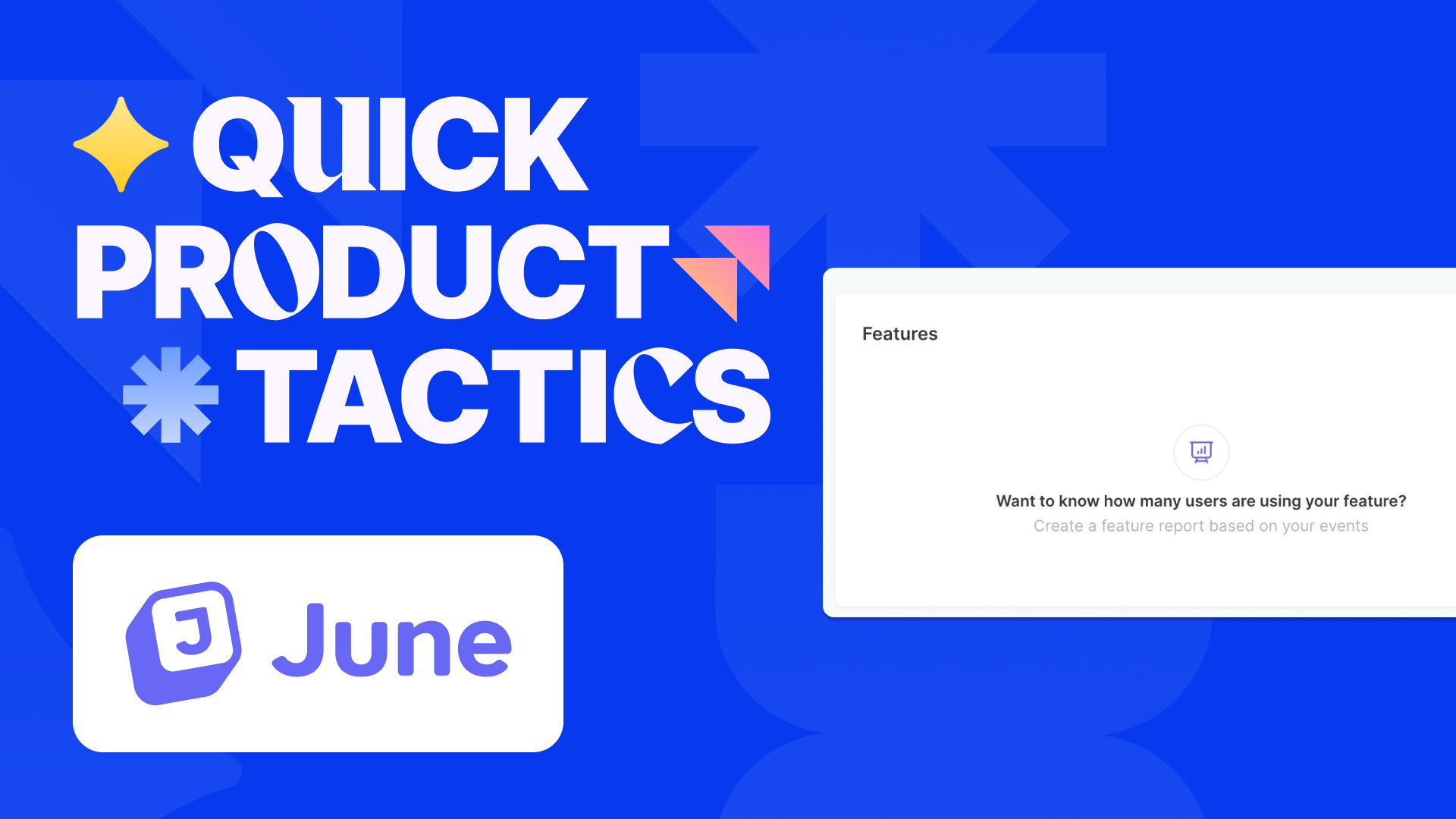
Product analytics platform June does this well:

Instead of simply saying “no events found” they offer a link to create events, and do the same with features.
This is a great way to leverage otherwise unused space and get users to engage with the product. There is a variation of this:
When the user wants an empty state
In an analytics platform, most users want more data, so an empty state isn’t desirable. But with some tools, users don’t want to accumulate the data, but get rid of it.
In this case, you can use the empty state to compliment the user on reaching their goal. From Slack’s activity tab:

You could imagine the same for to-do list, email and other apps where the user aims to remove data, not add more.
Why it works
Empty states are so important because they’re always at one extreme of the user experience: The user has either reached their goal or is at the furthest point from it. Having something useful for either of those cases engages users: Either because they use more features or because they see your product help them reach their goals.
Did you like this tactic?
Subscribe to this newsletter to receive a quick product tactic every week.
Help someone out?
If you know a product person this tactic would help? Send it to them!
Want to get featured?
Want to share your tactic? DM me!